This activity ground my gears trying to manage, fix, and muscle through (what I believe to be) uniterables in managing photos in Paint, GIMP, and Powerpoint!
It probably took more time than doing the ‘meat’ of this activity.
I’ll explain the somewhat arduous process later. In this blog post, we will try to explore the rich world of morphology in the context of image processing. As you can guess, morphology focuses on how the shapes and structures of images are modified by operations in this field of study. As images can be treated as a matrix of 1’s and 0’s, performing morphological operators can vary the landscape of the matrix.
One thing to note is that the math of morphology deals with set algebra. If you can remember your high school math (or even your Philo 1 classes), then you already have a jump start for what’s to come.
Let’s start wi
A. For the casual reader
A1. Basic operations, shapes, and structuring elements
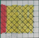
Square
Cross
Triangle
Hollow square
Above are the shapes for the first part of the activity
Cross
Diagonal
Vertical
Structuring element (SE): Horizontal
Square
Above are the structuring elements used in the morhological operations
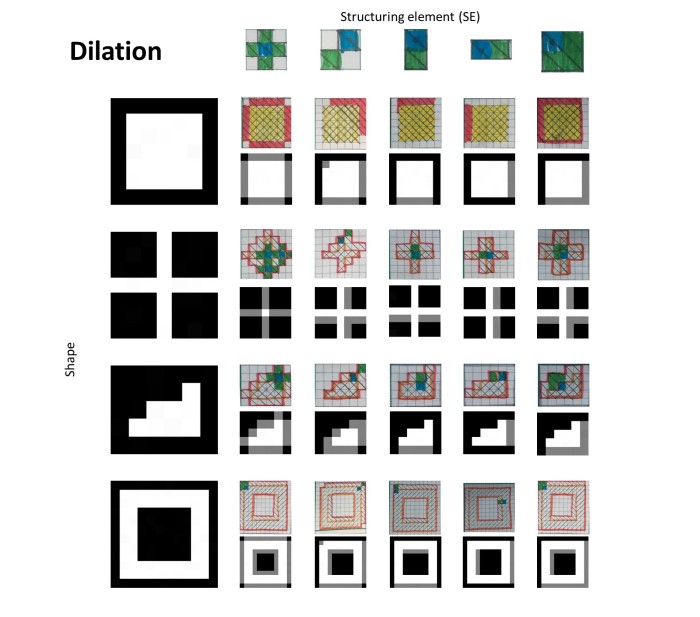
A2. Dilation
Square
Structuring element (SE): Horizontal
Computer dilation
Hand-drawn dilation (reversed SE origin)
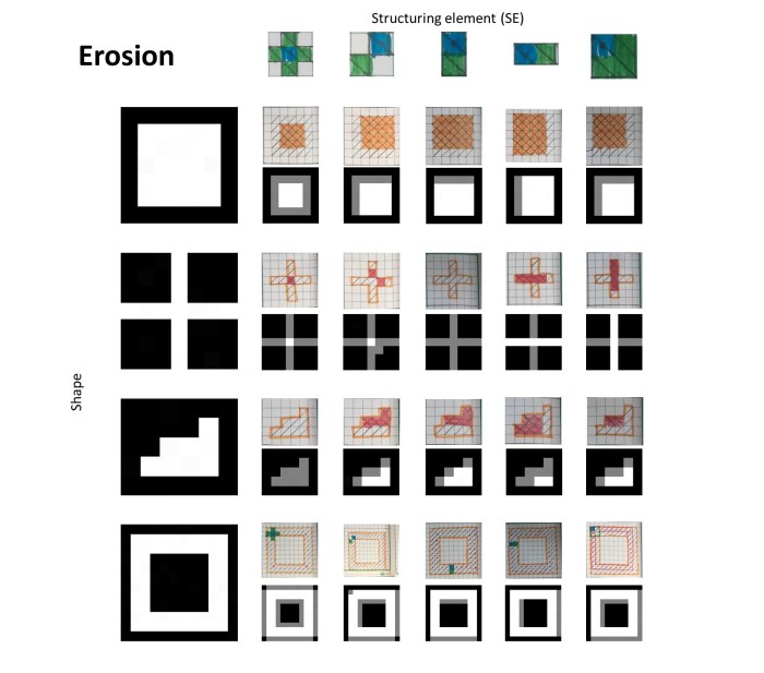
Below is the summary of the dilation operations for each SE on each shape.
A3. Erosion
Square
Structuring element (SE): Horizontal
Computer erosion
Hand-drawn erosion (no flipping)
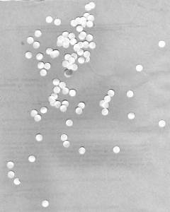
A4. Circles 002.jpg
For this part, I used the GIMP Guillotine (I have Roland Romero to thank for that), to slice the image to multiple pieces. 18 subimages of size 256×256 to be exact. Using the OpenImage morphological operation, as well as a circle structuring element (radius 3), I was able to obtain the sample cell sizes.
Subimage sample
After binarization and thresholding
After OpenImage
The important detail for this is the best estimate of the sizes. For the best estimate using the opening operation with a structuring element of a circle with radius 3, I was able to get a best estimate of 526.9 with a standard deviation of 608.2. It’s relevant that since the standard deviation is larger than the best estimate, this was most probably due to the fact that some of the circles were stacked up together, thus counting two circles as only one. There is a much more complex method of determining how to separate these cells (via watershed operations, but I wish I had more time for this). It is also noted that the structuring element besides the morphological operation is important in determining the outcome of the morphological operation. As with the thresholding, I chose a value that is 30 values higher than the peak value to sufficiently remove the white particulate matter on the lower left image above.
B. Programmer corner
I hope to update this as soon as I can find more time to finish this.
C. Evaluation
I am not satisfied with the way I handled this activity, though I wish I was more conscientious in executing these activites. I’ll give myself a 5/10 for this activity for barely being able to complete the requirements.
D. Acknowledgements and references
Ma’am Jing’s activity manual.
Roland Romero’s advice and blog for this activity.
Welcome back to the series of AP 186 blogs! Midterms just finished, and I realized that I was not too satisfied with the way I did my previous blogs,especially the last one. Yikes! As such, I would want to up the ante, and improve the structure and content of my blogs.
For this blog post, as well as the succeeding ones, I’m going to divide each of my AP 186 blog posts to two parts:
1. For the casual reader
I will showcase most of the rendered products of the activity in for the casual visitor. The aim of this section is to let the unknowing layperson who visits my blog see the objectives of the topics being accomplished in the most simple way. Simple tweaking of parameters, very few equations, and absolutely NO scilab/MATLAB code to be read! Perfect for the casual reader.
2. For the image programmer (or AP 186 student)
The contents of this section will house the nitty gritty details of how each part was executed. A larger portion of the blog will always be housed here, and is relevant to the following set of people:
myself, for future reference
Ma’am Jing, who will grade my gracious work
future employers who will be referred to this as my portfolio
and, future (or even current, but I am late to blogging once more) AP 186 students
I hope that my future blogs become more than just a school requirement.
With that out of the way, I present to you the next part of the AP 186 blog series, which focuses on
Segmentation (and COLORS!)
but more specifically, image segmentation!
A. For the casual reader
A1. Grayscale segmentation
Image segmentation is the process of obtaining regions of interest (or ROI) of certain photographs to be able to execute further processes. The pixels of the region of interest can have collective characteristics that may be extracted and found to be common with other regions in the circle.
Colors can also be segmented with this tool!
As pretty much with everything, images in grayscale are much easier to manage. Let’s start by going over an example of the mathematician’s insecure check:
So much for less than a penny.
From my past blogs (or if you’re new to the whole image processing world), images can be rendered from numerical matrices with each element corresponding to a pixel (px) in the digital photo. To simplify matters, imagine the range of values running from 0-255. 0 would represent the darkest of pixels, and 255 would be the whitest.
Segmentation is performed on this check so that it focuses on the pixels that reach a certain brightness threshold, and then treat the pixels that didn’t make the cut as plain black. Below, you would see the example of segmentation at px < 127 (note that 255 is the max value a px can have).
Segmented at px <127.
And since I love making gifs to be more economic in blog space, here is the check segmented under equally-spaced pixel thresholds.
Voila.
Part A2. Color segmentation
Due to the insatiable nature of people’s satisfaction, you would also want to see how segmentation via color is performed. You’re in luck, as we were also tasked to do this part!
I’ve prepared 5 images for this part, each photo having a dominant color, or none at all.
Blue earth
Aurora borealis
Georgina Paula
Macbeth chart
Strawberries
Such a dazzling array of color.
In the same way that grayscale image segmentation deals with choosing a certain threshold brightness value to select, color segmentation also needs a region of interest. Here are some examples of regions of interest chosen from the photographs above.
Aurora borealis
Macbeth chart
Strawberries
Georgina Paula
Blue earth
Part of the aurora
Yellow square
Strawberry patch
Deep blue
When we use our common programs (such as paint, or photoshop, or GIMP) to edit or generate photographs, oftentimes we see the RGB system of mixing colors. Trichomaticity has been a common system of generating colors, although for the simplicity of this activity, I will resort to using normalized chromaticity coordinates (NCC). The conversion of RGB to NCC effectively reduces one degree of freedom (chosen to be blue) so that only two values are tweaked (red, green). The conversion from RGB to NCC is as follows:
y axis for green; x axis for red values.
In this activity, I encountered two methods of color segmentation: parametric and nonparametric. The specifics between he two methods will be discussed in the second part, but all you need to know for now is that parametric assumes that the colors follow a certain equation, or more specifically, a distribution.
Part of the aurora
Yellow square
Strawberry patch
Deep blue
Nonparametric methods obtain a histogram of color values from the ROI and then using the histogram as a lookup reference to change the pixel values of the resulting grayscale image. I also included the histogram overlain with the NCC triangle to verify the colors of the chosen region.
Part of the aurora
Yellow square
Strawberry patch
Deep blue
Changing the size of the region of interest can have noticeable differences to the nonparametric segmentation:
See that as the region of interest is increased, more regions in both the parametric (3rd column) non-parametric segmentation (last column) become brighter. Also notice that the parametric segmentation was able to provide a smoother segmentation as compared to the non-parametric generation, but the non-parametric method was able to produce an image faster than the parametric method, and no assumptions to distributions were made.
I also explored changing the binning of the histograms in the non-parametric method.
There isn’t much of a difference in varying the binning size, but using 64 bins (bottom row) takes longer to reconstruct than 32 bins (top row), so it is advised to keep the histogram bins at 32 divisions unless the situation where a more sensitive reconstruction is required.
Now let’s get down to the explanation (code included!)
B. For the image programmer
B1. Intensity segmentation
Let’s go over the intensity segmentation code for now.
The code above shows the histogram generation of the check. The imhist command does not provide a normalized histogram, but it will do considering that the value where the histogram is centered is the important one.
Image histogram
To make sense of the histogram, let’s have a view of that obnoxious check again.
The image is mostly light gray, which would explain why the maximum value would be near 194. The muddled section to the left of the “Gaussian” curve is due to the black inking of the check around it. Since there’s no apparent white areas, the near 255 values do not have any hits at all.
Okay, now we explore different thresholds for the segmentation process. Code is below.
thresh_div = 16 //threshold divisions.
for i = 1:thresh_div
 BW = check < int(i*255/thresh_div); //Only shows pixel values less than px threshold
 imwrite(BW,'7A_check_threshold_'+string(int(i*255/thresh_div))+'.png')
end
clear
Note that since we’re dealing with more memory right now, I’d have to clear the memory after the code for the intensity segmentation.
Remember the first gif I posted above? Above is the code in how to write it. The third line is the ‘meat’ of the code. BW is basically the check matrix, but will only show the values that are less than the specified value. The second line also indicates the threshold value. In here, I chose to automate the generation of files. Basically, the chose values are the multiples of 256/16 = 16 (but then the max pixel value is 255 so I just converted the float values to integers).
The second line is also a Boolean operator. Every pixel that satisfies the operator returns as 1, and all the others 0. That’s why when the image is rewritten, the satisfying pixels returned as white in the segmentation. Notice that majority of the pixels light up near the maximum value (from 175 to 191, there is a huge leap of pixels whitening). This is in agreement with the histogram above.
B2. Region of interest
Here is the code for choosing the region of interest.
//7B: Color segmentation//7B_1 = 190:212,383:439; 190:294,383:466 for wider//7B_2 = 279:342,435:505//7B_3 = 112:130,192:208//7B_4 = 196:221,264:294; 196:264,264:332 for wider; widest 182:319,230:355//7B_5 = 174:230,343:452
The comments above are the chosen regions based on pixel coordinates.
i = 4 //choose which photo
BINS = 32; //set bin size
y1 = [190,279,112,182,174]; y2 = [294,342,130,319,230];
x1 = [383,435,192,230,343]; x2 = [466,505,208,355,452];
The variable i basically picks which of the 5 photos would bechosen. BINS sets the bin size for the non-parametric segmentation for later. The 4 lists are basically the coordinates from the comments a while ago. They’ll be picked by what value of i is for later. y1 and y2 are the ranges for the y coordinates (rows), and x1 and x2 are the ranges of the x coordinates (columns).
I = double(imread('7B_'+string(i)+'.jpg'));
R = I(:,:,1); G = I(:,:,2); B = I(:,:,3); Int= R + G + B;
Int(find(Int==0))=100000;
r = R./ Int; r_roi = r(y1(i):y2(i),x1(i):x2(i));
g = G./Int; g_roi = g(y1(i):y2(i),x1(i):x2(i));
The last section basically reads the image of choice. I deliberately named the images with string values for my convenience. The next line separates the 3 dimensional matrix to their red, green, and blue channels, and the last two lines convert the channels to NCC coordinates. The middle channel converts all zero values of the matrices to a high value so that division by a zero value in the last two lines do not produce a computational error.
You know what happens when division by 0 occurs.
Bascially, we want those pixels with a zero value to be divided by a large enough value t become zero anyway. It doesn’t do much with the code.
The chosen regions of interest are as follows:
Part of the aurora
Yellow square
Strawberry patch
Deep blue
My rationale for choosing these photos as well as the regions of interest are as follows:
First photo: green region. And it’s in my bucket list to see the Aurora Borealis.
Second photo: yellow region, as well as I wanted a near homogeneous region of interest. The Macbeth color chart was also something that was used for our AP 187 class.
Third photo: red region. And I love strawberries.
Fourth photo: human skin color region. And the baby is in stockings.
Fifth photo: blue region. Globe is used since it is my telecommunications service provider.
B3. Parametric segmentation
The parametric method what we want deals with the Gaussian distribution,
Where and are the standard deviation and the mean of the pixel values of the chosen channels of the NCC. For the purposes of this activity, the two chosen channels are green and red. In here, the standard deviation and the mean are taken from the red and green values of the pixels in the chosen regions of interest, then the probability density function (PDF) of each NCC channel is obtained by using the equation above. Basically, we’ll have both and for the chosen region of interest.
The code for parametric segmentation is given below:
The first two lines deal with obtaining the mean and standard deviations of the system. The next two lines generate the parametric segmentations of r and g using the Gaussian distribution. And the param_end variable basically multiplies the two independent distributions to result in the image, as the imwrite writes the image to a file. The remaining commented lines are alternatives to the mat2gray function.
The resulting images are shown below (already seen a while ago):
Part of the aurora
Yellow square
Strawberry patch
Deep blue
One thing to notice for the parametric segmentation is that the segmentation of colors is rather smoother because of the nature of its distribution. Parametric distributions are more often than not, continuous. The expected regions were also highlighted in white, similar to the way the check was segmented in the first part. Let’s move on first to the non-parametric segmentation before we make any further comparisons.
B4. Non-parametric segmentation
The code for the non-parametric segmentation is given below. Note that while the code for the non-parametric segmentation may seem longer, it assumes less about the distribution and actually uses a histogram from actual values. I’ll split the code to histogram-generation and backprojection.
B4.1. Histogram-generation
//BINNING//discretization of axes for histogram
rint_roi = round(r_roi*(BINS-1) + 1); gint_roi = round(g_roi*(BINS-1) + 1);
//dicretization of axes for backprojection
rint = round(r*(BINS-1) + 1); gint = round(g*(BINS-1) + 1);
//generates call list for each histogram cell
colors = gint_roi(:) + (rint_roi(:)-1)*BINS;
First part of the histogram-generation deals with the binning of the pixel values. I did both for the region of interest for the histogram, and the whole picture for the backprojection. colors is an interesting variable in the sense that it generates a call-number for each ordered pair in the NCC histogram space. I’ll explain a bit more in a while.
hist = zeros(BINS,BINS);
for row = 1:BINS
 for col = 1:(BINS-row+1)
 hist(row,col) = length(find(colors==(col + (row- 1)*BINS)));//lookup caller
 end;
end;
imwrite(hist,'7B_'+string(i)+'_'+string(BINS)+'_histogram_widest.png');
This section of the histogram code generates the histogram matrix itself. Remember colors? Well, colors basically splits the call number to two parts: its units digit (green) and it’s “tens” digit (red). “Tens” because it’s not really the tens digit, but think of it as the call-list is in base-32. Therefore, the secondary place value of the call number is your red value (from 1-32), as the primary place value is your green value (from 1-32 as well). But, as the histogram appears as a triangle, the numbers are clipped (The call list doesn’t really reach a maximum value of 32 x 32 = 1024, but only until 32 x 31 + 1 = 993).
Another peculiarity to note for this code is that it generates a rotated version of the NCC:
And the generated colors to histogram actually appears like this:
Brought to you by excel
Where the red values are actually on the left side, and the green values are on the top side. The histogram was generated this way due to the double for loop of the code above. It uses the length function to determine how many pixels have the specific red and green NCC values by finding its call number.
To whoever made the call list method…
The resulting histograms formed are in black and white, and after rotating and overlaying them to the NCC triangle, we’ll have something like these:
Part of the aurora
Yellow square
Strawberry patch
Deep blue
With the overlaying, I have effectively seen which colors are activated in the histogram.
(further improvements: the histogram masks I used are binarized, and not grayscale. For future users, please use mat2gray function on the histogram before writing the file so that the overlaying will be able to properly determine the weights of each NCC coordinate).
B4.2. Backprojection
The backprojection part of the non-parametric segmentation deals with getting the r and g pixel values based on the coordinates of the histogram to an empty matrix that has the size of the image. This way, the reconstituted pixels have r, g, and b values that are within the value ranges of the histogram.
//BACKPROJECTION
backproj = zeros(I(:,:,1)); //sets matrix
for row = 1:size(backproj,1)
 for col = 1:size(backproj,2)
 backproj(row,col) = hist(rint(row,col),gint(row,col))
 end
end
B4.3. Thresholding
threshold = 0.25 //chooses threshold value (0.25, 0.5 or 0.75)
backproj_1 = mat2gray(backproj)
backproj_2 = backproj_1 >threshold
imwrite(backproj_1,'7B_'+string(i)+'_'+string(BINS)+'_nonparam.jpg');
imwrite(backproj_2,'7B_'+string(i)+'_'+string(BINS)+'_nonparam_mask.jpg');
clear
The last part of the code deals with thresholding. The backprojected matrices are binarized similarly with the histogram matrices, so we need to get the mat2gray of the matrices first. After doing so, the values of the matrix elements will now range from 0 to 1 (and not just exclusively 0 and 1). With this mat2gray function being applied, we can now apply a certain threshold value. If the threshold is lower, more pixels are converted to 1 and the rest are left 0. The resulting matrix can be used as a mask to the original image to isolate the pixels having your desired color based on the ROI histogram made a while ago. Below is the baby picture overlain with masks of different thresholds. I also added two more sizes of regions of interest, one larger and one smaller, to be able to see the difference in the thresholding as well.
As seen in the photo above, choosing a wider ROI greatly affects the thresholding, so you can have two parameters to vary your threshold value. You just have to be very careful in choosing your ROI, but it will be up to you how to do it.
C. Evaluation
This has been my most comprehensive blog so far. Albeit being a bit later than usual, I was able to provide additional visualizations to the histogram so that people have a better idea of what their regions of interest are portraying. And due to my excellent rationales for choosing the photographs, I rate my self 10/10 for this activity.
D. References and Acknowledgements
Dr. Maricor Soriano’s Activity Manual on Image Segmentation.
My seatmate Roland Romero for his valuable advice on the thresholding as well as helping me provide ways to use the threshold images as masks to the original images. Check his blog out here.
Angelo Rillera’s blog for giving me inspiration to work hard on making and understanding the histogram. I learned a lot from here.
And to Ma’am Jing for her tireless effort in teaching the class repetitively on the parametric segmentation.
Properties and Applications of the 2-D Fourier Transform
In the last activity, I discovered the basics of the 2-D Fourier Transform and how powerful it can really be.
Part 1. Anamorphic property of FT of different 2D patterns
The anamorphic property describes how a wide object in a certain space will be narrow in its inverse space (and vice versa). Here we show the certain examples of the anamorphic property.
Part 1a. Tall rectangle aperture
Part 1b. Wide rectangle aperture
Part 1c. Two dots along x-axis symmetric about center
Part 2. Rotation property of the FT
Part 2a. Basic sinusoid function
Part 2b. Vertical biasing
Notice that the center dot was added
Part 2c. Rotation
Part 2d. Multiplication
Part 2e. Addition
Part 3. Convolution theorem redux
Part 3a. Circle
Part 3b. Square
Part 3c. Gaussian
Part 3d. Random locations
Part 4. Fingerprint
Part 5. Lunar image
Original image
FFT. Remove the bias!
Part 6. Painting
References
Soriano, M. Properties and Applications of the 2-D Fourier Transform. Applied Physics 186 Activity Manual.
Carlo Solibet, Roland Romero, Robbie Esperanza, and Maricor Soriano for their ever-welcome assistance to me.
Fourier transforms are one of the most useful transforms known to man. Snapchat has this mathematical beauty to appreciate, else they’d have to find another way to modify filters. For 2-D, it follows the general form
It is an integral transform that extracts a function in x to be a function in inverse space (or 1/x). Along with photo apps, it is extensively used in signal processing, image processing, and physics (as if we don’t already know that).
For pretty much the rest of the images to be used here, we’ll be going with 128×128 resolution to be kind to our fan-favorite fft2 function. Contrary to usual situations, smaller resolutions are actually better here to better visualize the pixel-large delta spikes for the sinusoids to be produced later in this activity.
Part 2. Familiarization with the 2-D discrete fast Fourier transform
circle = imread('AP186_circle.png');
fft_circle = fft2(double(circle)); //fast fourier transform. converts matrix values from integer to double
Enter: circle.
We start with a circle of radius 0.1. Load it up as imread, then we apply the function fft2 on the double. As with the manual, fft2 works best for pixel resolutions with base 2. An application of the double function is used to ensure that the resulting FFT is a 2-D matrix, and not just a single list (which happens too often as I am forgetful).
A3 = mat2gray(abs(fft_circle));
//mat2gray solves this: //imshow(uint8(255*abs(fftshift(fft_circle))/max(abs(fftshift(fft_circle)))))//absolute value of the fft of the circle
imwrite(A3,'5A3.png');
I feel that I need some explaining to do for mat2gray, as I will happily use it for future activities dealing with FFT and images. Mat2gray is basically your one-stop-fix-your-problems-shorten-your-code function that normalizes the matrix and then multiplies it by 255, the maximum brightness value for an unsigned 8 bit integer (which mat2gray also converts).
Like a pizza cut the wrong way.
Long story short, it converts a matrix to a grayscale image.
Additionally, we need to get the absolute value since the FFT operation of a real function or matrix yields a complex matrix. As such, we only need the modulus of the value.
From the manual, we know that the quadrants are diagonally reflected, the resulting image will be presented the wrong way.
With the fftshift (2-D) mode, here we see the familiar Airy pattern when the Fourier transform. It looks like a ripple of water radiating from the center point. This will be important for the convolution parts later. Remember:
A5 = mat2gray(abs(fft2(fft_circle))); //FFT it back
imwrite(A5,'5A5.png');
This can also be just the same image.
Finally, we apply the Fourier Transform once more to generate the “same” image once again. Due to the symmetry of the image along the horizontal center line, it is hard to determine whether a double application of fft2 will really provide the same result.
Now, let’s move on to an assymetric figure.
Part 2b. Letter A
I used paint to generate this baby.
Behold the mighty Comic Sans
(I’ll refrain from putting the code here as it is just similar to 2a).
The next three pictures show the same method done in 2a, but for the letter A (would’ve done the character more justice if it were part 2a).
Not shifted
Shifted
FFT of FFT.
Looking at the FFT-shifted photograph, we see that a cross has been formed for the letter A, and also signifying that the FFT was centered on the middle thanks to shifting. An additional point to note is that the letter A is asymmetrical to both the horizontal and vertical center lines. As such, the shifted FFT is also expected to be asymmetric along both axes. My guess is that a symmetrical character along the vertical would show symmetry.
After applying another FFT to the FFT of the character, we see that the letter A is inverting.
Anarchy.
I like it as it shows that I am not just copying the original photo. For people obsessing over resolving matters, change fft2 to the second application to ifft.
fft2(fft_matrix); //inverts A
ifft(fft_matrix); //does not invert A
Part 2c. Sinusoid along x (corrugated roof)
Similar to 2a and 2b, I will refrain from posting similar codes for 2c.
However, there is a nuance to be addressed when plotting functions with negative values as greyscale images. Take the standard sine function for example
B = sin(X*25) //typical sine function
It would still look like a sine function, with the exception that the bright lines are thinner than the dark lines. For a trigonometric function with no vertical biasing, this should not be the case.
B_vertical_bias = sin(X*25) + bayas
The reason for this is that in converting a grayscale image from a 2-D matrix, the negative values are treated as zeros. But if we simply just add 1 to make the minimum value of the sine function to 0, the maximum value would be 2. This is another red flag.
Hideous.
To avoid these flags, we perform vertical shrinking and biasing via
B = sin(X*25)*0.5 + 0.5 //with vertical shrinking and biasing
Manipulation is key.
With these changes, I would be able to make a sine matrix with values ranging from 0 to 1.
Not FFT shifted
FFT shifted
FFT’d the FFT.
The resulting unshifted FFT looks like a completely black picture with the exception of a few incomplete dots on each corner of the image. With the fftshift, we see three dots in the center vertical line, with the center dot being the brightest. Analytically, this means that the center dot represents the vertical biasing performed a while ago, and the two dots equidistant from the center represent the frequencies of the image. As expected, the FFT of a sine function is a function.
Part 2d. Simulated double slit
Next part deals with the double slit aperture.
Flashback Physics 103.
The double slit was generated via this code. Thankfully, no biasing needed:
C = zeros(nx,ny)
C(find(X<0.05 & X>0.025)) = 1; //vary to change the width and separation
C(find(X<-0.025 & X>-0.05)) = 1;
If we want thicker lines in the original space, we just adjust the parameters wherein the elements in the zero matrix is 1. The FFT results are quite interesting.
Not FFT shifted
FFT shifted
Inverse FFT’d
No one loves you, unfftshifted photograph.
For the FT shifted photograph, we see a familiar fringe pattern found in the famous double slit experiment. Here I found the realization that
The Fourier transform of the double slit aperture is the interference pattern.
For this shape, I decided to use inverse FT just because.
Part 2e. Square function
Regular quadrilateral.
Not shifted. Check corners.
FFT shifted. 2-D sinc function.
FFT of FFT.
Next section, we deal with the square aperture. After obtaining the fftshifted image, we obtain an interesting crosshair-like pattern. Projecting the image to either the center horizontal or vertical line, we can see the sinc function. This sinc function is actually the FT of the rectangle function, which is basically the 1-D version of the quadrilateral. The FT looks symmetric due to the fact that the square is symmetric both vertically and horizontally.
Wow.
Part 2f. 2-D Gaussian bell curve
For the next part, we deal with the peculiar Gaussian function. Peculiar in the sense that
…the FT of a Gaussian function, is… well…, another Gaussian function.
Gaussian trasparency.
Not shifted. Check corners.
Again, nothing too interesting for the unfftshifted photograph, but look at when it’s shifted. Everything becomes clear.
FFT shifted a.k.a. bebe gaussian.
…it’s another Gaussian. How surprising! This verifies that what I generated originally is actually a Gaussian function.
FFT’ed the FFT.
And here we see that returning it back to its original space leads to another Gaussian function.Very reminiscient of old memes
Part 3. Simulation of an imaging device
We now approach the convolution section of this activity. I am tasked to convolve the photo of Ma’am Jing’s glorious lab’s initials to a circular aperture.
Image
Aperture
These are the two photos to be convolved. VIP image as the object, and the circle as the aperture. We already take the circle to be in frequency space, so we just fftshift it as seen in the code below.
vip = imread('5B_vip.bmp'); //already grayscaled for my convenience
ape = imread('5B_circle.bmp');
F_ape = fftshift(double(ape)); //aperture already in fourier plane
F_vip = fft2(double(vip));
Short note: remember that the FT of the circle is the airy pattern. So in the original space, we are convolving the image to this Airy pattern. In frequency space, we are multiplying the Fourier transform of the VIP image to the circle.
Remember me?
We use the following code for the convolution process itself:
Here we see that the Airy pattern has been casted t the VIP lettering, thus completing the convolution. Now it looks like it’s the letters that are forming the ripples.
Part 4. Template matching using correlation
Correlations are usually needed to determine repetitive patterns, such as repeating letters in certain statements, such as the one below
Very rhymy
One of the dominant letters in this sentence is the letter ‘A’ (seems to be a recurring theme this blog). We then turn our attention to the code:
If the reader would kindly notice the sharp spikes of intensity in the right photograph, then he/she/it/they would notice that these spikes are coincident to the locations where the capital letter A was placed. As such, the ctrl+F function of the correlation function was put to test with these photographs.
.
Part 5. Edge detection using the convolution integral
We’re not going to do away with this image.
For the last part, we will trace the edges of the VIP letters via these 3 x 3 matrices. It is important to note that the elements of these matrices are zero-sum, and produce edge elements similar to their shapes.
I added a non-zero sum matrix just to see what it does. If the sum isn’t zero, it serves to not really change the image much. I would want to investigate why is this so given that I spend more time on this eye-opening activity.
Part 6. Evaluation
Peformance-wise: 8/10. I could have done a lot more with the activity but given my self-inflicted time constraint, my performance was clipped. I could have provided a better explanation for the correlation, or the edge-tracing capabilities of convolutions to zero sum matrices. Despite that, I believe that I was able to perform the activity well.
References
Soriano, M. Fourier Transform Model of Image Formation. Applied Physics 186 Activity Manual.
Sinc and rect function photograph taken from https://www.chem.purdue.edu/courses/chm621/text/ft/basiset/rect/rectangle.gif.
Quicklatex.com for the matrix images.
Carlo Solibet, Robbie Esperanza, Roland Romero, and Dr. Maricor Soriano for their invaluable assistance in helping me finish the activity.
To avoid further negativity for my blogs, let’s rename my posts to
starting to become a promising academic endeavor:
AP 186 edition.
In the third installment, I will be discussing about our activity called area estimation. In the age of computers, a lot of analysis in science can already be accomplished mainly on our devices. Gone are the days where the only option to perform graphical analyses is by hand.
I consider myself blessed since I was born in the age of technology, although I believe that not a lot of people are sufficiently aware of what the limits of our devices are (but then again, I may just be shined with a bit more light than others). At the very least, I hope that I may be able to shine a bit of light to people who might be able to read this.
Going back to the topic: area estimation.
Part 1. Green’s function
It’s best if we start with the discussion of Green’s functions for now. The simplified equation gives equation for obtaining an area given the Green’s function is
x and y are your friendly neighborhood Cartesian coordinates. We do not expect current programs to fully comprehend the complexity of continuous variables, so we recast the equation above to a digestible, discretized form,
Some things to note:
N here would be the number of pixels that constitute the edge of the image, x and y would refer to the horizontal and vertical pixel coordinates, respectively. As with previous activities, the origin is at the top left corner of the image.
The sum is cyclic, as the integral in the 1st equation is a closed contour integral. At the Nth iteration of i, the 1st pixel is designated as the (i+1) pixel.
The order of the pixel in the iteration of the sum is important. The progression of the contour integral follows a specific trace of the contour (counter-clockwise positive, clockwise negative), so it would make sense for the discretized sum to be the same. The code later will give light on this.
Part 2. General code used
image = imread("insert image filename here")
Nothing fancy here; just load the image to scilab. The image format used for now is monochrome bitmap to avoid having a color image.
//finds x,y coordinates of edges in the image (contour of image)
[x0,y0] = find(edge(image)) //for geometric figures
[x0,y0] = find(edge(image,'prewitt')) //for land area
Next part finds the edge contour of the shape needed to be analyzed. We only need the boundaries of the figure and nothing else. x0, y0 are the edge coordinates.
Note that the real land area uses a prewitt edge finding algorithm for the google map edge later. See discussion there, not here.
//corrects x and y coordinates with respect to the centroid
x_cent = sum(x0)/length(x0);
y_cent = sum(y0)/length(y0);
x = x0 - x_cent; y = y0 - y_cent;
Standard pixel coordinate systems use the top left corner of the images as the origin, so translations according to the centroid are performed. Given a plane of uniform density but arbitrary shape, the centroid is the point in the plane coincident to the center of mass, and can be expressed as a function of 2-D Cartesian coordinates as:
N is the number of pixels, and x_i, y_i are the coordinates in pixel space. We need to center the origin on the centroid for more accurate calculations of the area.
//generates theta list in polar coordinates
 r = [];
 theta = [];
 for i = 1:length(x)
 theta(i) = atan(y(i),x(i));
 r(i) = sqrt(y(i)**2 + x(i)**2)
 end
Remember that the contour integral in Green’s theorem requires that the progression of the sum of the integrands follow the trace of the contour integral. To ensure that this happens, proper order with respect to the angular variable, is required. For this purpose, the code above ensures that I first have the list of the values of and . The radius variable is more for completion and verification of the radius of certain geometric figures.
//obtains correct order of theta
 theta_corr = []
 [theta_corr, k] = gsort(theta, 'g', 'i')
This part of the code is pretty important, as it sorts the values from lowest to highest.
A little something about the gsort function (c/o scilab documentation):
gsort is a quick sorting algorithm. For my purposes…
inputs:
list to sort – theta
type of sorting to perform – ‘g’, or sort everything. (Note that gsort can also organize lists that have more than 1 dimension)
order – ‘i’, or increasing
outputs:
theta_corr – here be my list of proper order
k – here be my list of indices of the previous unsorted list. Very useful for next step
//sorts x and y lists according to increasing theta and applies Green's formula
 area_green = 0;
 x_corr = x(k);
 y_corr = y(k);
 for i = 1:length(x)-1
 area_green = area_green + x_corr(i)*y_corr(i+1) - x_corr(i+1)*y_corr(i)
 end
area_green here is our sum variable, and will be responsible for giving us the sweet sweet area. x_corr and y_corr are the sorted lists of the Cartesian coordinates according to increasing theta (see how magical k is; make it an argument for the original list and it will sort accordingly. Thank you, Carlo Solibet for this piece of juicy info). I then proceed to sum the contributions of the integrands to the sum, but take note that I only iterate until the term due to the fact that the sum should be cyclic: term is the first term.
//adds the final term to the sum (when i = max value)
 area_green = area_green + x_corr(length(x))*y_corr(1) - x_corr(1)*y_corr(length(y))
 area_green = area_green*0.5
 area_green_scaled = area_green*(1/9.8)**2 //for area scale
Here we add the last term, and since the sum should be halved, I did so as well. Last term to be discussed later, as this applies to the area estimation in google maps part.
//generates relative deviation of calculated area to actual area
 area_actual = %pi*(mean(r))**2
rel_dev = 100*abs(area_green - area_actual)/area_actual
No new method testing goes to work not bringing its relative deviation values with him/her!
Part 2. Estimation of a geometric figure
It’s a circle.
Now, we use the code to test it on a circle, the official 2-D geometric mascot of physics. For this part, I created a 1000 x 1000 pixel grid of zeros, and drew a circle with a radius that is 60% of the length of half the side length. I centered the circle in the middle of the grid for simplicity, and the code is right here
//Generates the circle image
r = sqrt(X.^2+Y.^2);
A = zeros(nx,ny);
A(find(r<0.6)) = 1;
I’ll refer to the units of length here in px (for pixels), and the area px^2. Theoretically, the radius of the circle should be equal to 300 px, and the area should be equal to . But due to the resolution of the image, I took the mean of the r values (ha! it has uses), and used it to calculate the ‘actual’ area of the circle subjected to pixelation in a 1000 x 1000 grid and resulted to a value of . For the area calculation using the discretized Green’s function, I obtain , resulting in a 0.0023% relative deviation with the actual area of the pixelated circle.
This method must be pretty neat. Now let’s try it with something a little bit more complicated. Real areas.
Part 3. Land area estimation
The next part of the activity deals with the estimation of the land area of a certain building. I originally aimed for estimating the UP Diliman Church of the Holy Sacrifice, but part of the prerequisites for choosing an area is that the geometry has to be a bit complicated.
Complicated land area filed under: wishful thinking.
I accomplished and submitted this activity late, so someone already chose the National Institute of Physics (Robbie…). So to please my girlfriend, who is most probably not going to read this blog anyway, I chose the UP College of Law!
It’s not a circle!
It is important that the scale is determined. How many meters to a pixel. From the tiny scale in the bottom right corner of the image, it was determined to be 1 meter per 9.8 pixels. Recall that the scaling is important in this part of the code:
area_green_scaled = area_green*(1/9.8)**2 //for area scale
Modifications to the original image have to be made, namely to convert the image to a simple black-white (BW) image below. For this, MS Paint has my gratitude.
Primed for editing
Now, we find the edge coordinates. It wasn’t as simple as with the geometric figures due to the rough edges from the conversion to a BW image. This is why I used the prewitt algorithm to ensure that a full coverage of the edge. But I mostly found it via trial and error.
Unfortunately, I was not able to obtain the actual and area of Malcolm Hall (UP law), but I was able to obtain an area of . That’s a third of a hectare, which I find to be somewhat reasonable.
Part 4. Image J
Now we come to arguably the most perplexing section of the activity. Image J!
For future purposes of area or length estimation, Image J will be my best friend. It makes area or length estimation easy as you only need to tinker with the UI of the program. As with Scilab, the program is free.
Model for the day: beep card.
Our example for today will be the LRT/MRT beep card. More power to mass transit. I chose this card to make the example rather easy.
Setting up the scale.
First step is to measure the actual length of the card, which was 85.6 mm. Then use the Image J’s digital measuring tape to get its distance in pixels (3064). Set the unit of length to mm and voila, you get your scale: 35.7944 pixels/mm.
Featuring Knock Knock by Nikki Yanofsky.
For testing of the scale, I obtained the measurement of its diagonal. Actual measurements led to 99 mm, whereas the digital length was obtained to be 98.342. Pretty darn close. 0.66% close, in fact.
Part 5. Evaluation
9/10. I was able to fulfill all of the required tasks for this activity, although I wish I explored more geometric objects, or tested other features of Image J.
Part 6. Acknowledgements and references
Soriano, M. Length and Area Estimation in Images. Applied Physics 186 Activity Manual.
Equation and explanation for the centroid. Taken from http://www.ce.memphis.edu/3322/Pdfs/PaulsPDFs/Centroids%20and%20Moment%20of%20Inertia%20Calculation.pdf.
Photograph for the Chapel of the Holy Sacrifice. Taken from https://www.pinterest.com/pin/563231497122075996/.
Carlo Solibet, Mich Cirunay, and Roland Romero for their assistance in performing this activity.
Not my proudest academic endeavor: AP 186 Edition EP 2
I hope that this will be the last of the series.
Alright, let’s get down to business!
Part 1: Introduction
This activity is all about generating images in Scilab via coding. The program isn’t new to me, but this is good exercise as I am not really that adept with photo editing.
All photos used followed a 500×500 pixel grid. Codes were adapted from Antonio Paguirigan’s AP 186 blog at antonstein.blogspot.com.
Part 2a: Square aperture
Square aperture centered
Code:
nx = 500; ny = 500; //defines the number of elements along x and y
x = linspace(-1,1,nx); y = linspace(-1,1,ny); //defines the domain and range
[X,Y] = ndgrid(x,y); //creates 2-D arrays of x,y dimensions
r = sqrt(X.^2 + Y.^2); //element-per-element squaring of X and Y coordinates
A = ones(nx,ny); //make a 2-D matrix of zeros with nx by ny dimensions
A(find(abs(X)>0.5)) = 0; A(find(abs(Y)>0.5)) = 0; //square modeling
imwrite(A, 'centersquare.png'); //I went straight to imwrite
Notice that instead of using scf() functions I used imwrite so that it’ll be easier for me to save the images and actually post them here in the blog. Part of this’ll the fact that my other source used this function instead of the scf.
Note that for the find function in the code, you can adjust half of the side length by changing the value of 0.5 to something else. Limit of course is 1, which is the max value of each dimension from the plot. nx or ny just defines the size of the image to be formed. For all of the images, I used this resolution.
Part 2b: Sinuosoid along the x-direction
Corrugated roof propagating along x
Code:
 B = sin(X*45); //changing coefficient of X changes frequency of B
imwrite(B, 'corrugatedx.png'); //Writes file
The sinusoid along the x-direction was generated by (obviously) generating a sine function values along the x-direction in a list as seen in the code. A 2-d mapping of the sinuosoid appeared to be similar to a corrugated roof. Increasing the coefficient of X also increases the amount of white spaces shown on the figure. Changing the orientation from a horizontal to a vertical propagation can be done via:
Rotate the image 90 degrees clockwise (or counterclockwise)
But of course we want to make things more mathematical, so we can always choose to let B equal to this instead:
B = sin(Y*45);
Please choose the second method when going for a sinusoidal pattern in the y-direction.
Part 2c: Grating along the x-direction
Grating along the x-direction
Code:
C = zeros(nx,ny); //generates 2-D matrix filled with zeros
C(find(B>0)) = 1; //changing value changes grating width. B related to C
imwrite(C, 'grating.png');
I took advantage of the fact that the grating along the x-direction is thankfully similar to the previous photo (corrugated roof). The striking difference is that the evolution from the minimum to the maximum value of the values of the matrix for the corrugated roof example is gradual. In the grating example, the change from light to dark values is abrupt. In terms of array element values for the grating example, neighboring rows may change from 0 to 1 immediately instead of having decimal values in between.
The similarity between the production of the array for the grating and the sinusoid was taken advantage of as seen in the code. From the given sinuosoid matrix B, the “abruptness” condition was set by automatically changing any positive array element value to 1. An equal distribution between light and dark bands is expected since the values of the sine function are centered along 0 anyway. Yehey for convenience!
Part 2d: Annulus
Annulus
The production of the annulus is quite similar to the generation of the circle. It is easy to see that [6] the doughnut shape could be replicated by making a big circle, and then subtracting a concentric circle with a smaller radius to the first one made. The code is shown here:
D = zeros(nx,ny); //generates 2-D matrix filled with zeros
D(find(r0.3))=1; //used an and argument to generate annulus
imwrite(D,'annulus.png');
As seen in the find argument, the radius of the bigger circle is 0.8 whereas the smaller circle is 0.3. It’s equated to 1 to show that the number 1 corresponds to white (no cultural or racial meaning intended).
Part 2e: Gaussian transparency
Gaussian transparency
Here comes the code train:
E = exp(5*(-r.^2)); //scaling coefficient (5). Increasing it decreases the glowsize
imwrite(E, 'gaussian.png');
Wow the code is so short. So efficient. This is all thanks to a prior variable for generating the circle:
r = sqrt(X.^2 + Y.^2);
Increasing the coefficient of the term (5 in my example) reduces the glow size of the Gaussian transparency. We’re basically quickening the rate at which the value of E at each element is reduced.
Like I’m quickening the pace while I catch up on my backlog.
Part 2f: Ellipse
Ellipse
a = 1; b = 2.25; //scaling factors for ellipse
r_e = sqrt((X.^2)/a + (Y.^2)/b); //equation of ellipse
F = zeros(nx,ny);
F(find(r_e<0.6)) = 1;
imwrite(F,'ellipse.png');
Above is my code for generating an ellipse.
If, for any reason, that my blog gets read by people who have not yet taken coordinate geometry (Math 54), then I will explain to you that the equation of the ellipse is just similar to a circle. Should you not want to read the pre-formatted code, the equation is
This is to my benefit, since I don’t have to search for something unfamiliar again. Varying the parameters a and b changes the size/fatness of the ellipse. If only I can change parameters to make me fat that quickly…
for the un-fftshifted version of the square aperture…
We go to the cross. Let’s go back to the code of the square:
A = ones(nx,ny); //make a 2-D matrix of zeros with nx by ny dimensions
A(find(abs(X)>0.5)) = 0; A(find(abs(Y)>0.5)) = 0; //square modeling
The production of the square was unorthodox in the way that instead of generating a pre-made matrix of zeros (as with most of the other shapes), the square had a pre-generated matrix of ones, then we set the values outside a certain range (in this case, 0.5) to zero. But for the cross, I went backto the standard zero pre-generated matrix and just reversing the conditions. If it weren’t reversed, I’d have a black square on a white background (I tried, so you have to trust me). As with the square, increasing the threshold value (0.3 for now) in the conditions of the G matrix thickens the cross width.
Part 3: Self-evaluation and difficulties encountered
Skill-wise: 10/10
I was able to successfully perform the needed tasks and explain the code. As for promptness…
Not my proudest academic endeavor: AP 186 edition EP 1.
I want to apologize to all those who were patiently waiting for my published posts to appear (namely my compassionate professor, Dr. Soriano). I finished Activities 2 and 3 before ensuring that I have enough time to write the blog post. Spending too much time thinking about and enjoying how to go about the activities and actually writing the blog is not the way to go. I do wish that there will only be one episode for this pilot series.
Anyway, let’s get down to business.
Part 1: Introduction
The title of the activity is Digital Scanning. We’re tasked to obtain an old plot and encode the data points to a spreadsheet program. This is possible by,
“…us[ing] ratio and proportion to find the numerical values of a digitally scanned hand-drawn plot.” (Soriano, 2016)
She asked us to go around UP to find such plot. NIP is fine. I went to the library to look for theses I could scan. PSA #1: You cannot take manuscripts out of the NIP library. So I borrowed a book. As luck the god of looming obligations** would have it, I found the 1987 proceedings for the counterpart of Samahang Pisika ng Pilipinas (SPP) then.
Part 2: Scanning
From page 119, I scanned this in the NIP Admin Office. PSA #2: You can scan small amounts for free!
Original scan.
Of course I needed to rotate, scale, and crop the original scan so that it’s easily readable by a reasonable human being. The graph is an amplitude vs. driving frequency plot, with x and y gradations of 2 units per major line.
Original scan.
After aligning the x and y axes of the image with respect to the horizontal and vertical, I am now ready for the next section of the activity: calibration.
Part 3a: Calibration via axis gridlines
For the calibration, I first needed to see how distant each gradation in the scanned graph was from the adjacent ones in pixels (px). This meant using GIMP’s pixel location pinpointer feature as well as Excel to tabulate results. I found out that each major line was around 110 px apartfor both x and y axes (thus making it ~55 px/unit). The origin equivalents of (x_i, y_i) were given to be (70, 1127).
Part 3b: Calibration via specified points
I soon found out that it was not that important as the real calibration came from choosing points in the plot (namely x_o and y_o) and locating their image coordinates (x_i and y_i).
In the spirit of AP 187-Activity 1, I chose 11 calibrationpoints. Note that some of these points were only estimates of their real values (since I had no tabulated data points available for the graph). These were enough to find equations relating the image coordinates (x_i, y_i) to the object coordinates (x_o, y_o) for the reconstruction of the data points. I found these equations to be
for x,
x_o = 0.0181x – 1.2628
and for y,
y_o = -0.0181 + 20.431
I was able to obtain linearity coefficients of R^2 = 0.9999 for both curves, thus indicating that these equations are good fits.***
X-axis calibration.
Y-axis calibration.
We can now move on to the reconstruction. Time check, 2:20 am.
Part 4: Reconstruction
Ah, the clerical section of the activity. In hindsight, I should have not chosen a graph with 168data points. Although I must admit it was satisfying after I finished encoding everything. Behold the reconstruction in all its glory!!
Look at this beautiful piece of art.
Almost, if not all the data points were covered properly. I’d like to give myself 3 pats on the back for this. I hope Ma’am Jing uses this blog post as a shining example for budding AP 186 students in the future.
Part 5: Self-evaluation and difficulties
Activity rating: 10/10
I believe that I was able to fulfill the objectives of the activity properly. I mean look at that reconstruction.
Punctuality rating: 7/10
Surprisingly, the difficulties lay mostly in how I wanted to start. It took me a while since it’s my first time blogging. And I panicked since my graph had a lot of points. But after I did it, I felt great. I wish I did it sooner, though.
Reconstructing was the most taxing part. At some point I reversed the x and y axes of the calibration curves. Stupid me.
I like this blog format. I feel liberated.
Part 6: References and Acknowledgements
Applied Physics 186 Activity Manual: A2 – Digital Scanning by Maricor Soriano, PhD.
GIMP ver. 2.8 as my top choice for the photo processing program.
Ate Lina from NIP Admin for scanning the plot.
Angelo Rillera for being a patient AP 187 partner while I finish my AP 186 activity backlog.
Red Hot Chili Peppers for my choice jam while I finish this.
Part 7: Notes
*I want to curb my procrastinating habits.
**The day I scanned the photo (2016-08-17) was the day before our 4:30 am flight to Iloilo for SPP. And at this point, I still haven’t reached 50% for my oral presentation, which was due 3:30 pm Thursday (the day after)*. I wish I could write a blog about it when I have free time. Lots of experiences inebriated with learning.
***I would like to point two things out. First of which is that the reason why the y equation had a negative slope was that the y-pixel value increasedas the cursor was moved downwards. Secondly, if you obtain the reciprocal of 0.0181 (which was the slope for both x and y), you will get ~55 px, which was the pixel distance measured in between major axes. Part 3a wasn’t so useless after all.
Part 8: Resource links
Here are the links for the excel files and images I used.
This blog was created in partial fulfillment of the Applied Physics 186 undergraduate course of the University of the Philippines, Diliman.
This blog is also for the lulz.
This is your very first post. Click the Edit link to modify or delete it, or start a new post. If you like, use this post to tell readers why you started this blog and what you plan to do with it.


 and
and  are the standard deviation and the mean of the pixel values of the chosen channels of the NCC. For the purposes of this activity, the two chosen channels are green and red. In here, the standard deviation and the mean are taken from the red and green values of the pixels in the chosen regions of interest, then the probability density function (PDF) of each NCC channel is obtained by using the equation above. Basically, we’ll have both
  and
and  for the chosen region of interest.


 locations


![A = \sum_{i=1}^{N} \left[ x_{i}y_{i+1} - y_{i}x_{i+1} \right]](https://s0.wp.com/latex.php?latex=A+%3D%C2%A0%5Csum_%7Bi%3D1%7D%5E%7BN%7D+%5Cleft%5B+x_%7Bi%7Dy_%7Bi%2B1%7D+-+y_%7Bi%7Dx_%7Bi%2B1%7D%C2%A0%5Cright%5D+&bg=ffffff&fg=424242&s=0&c=20201002)


 is required. For this purpose, the code above ensures that I first have the list of the values of
  and
and  term due to the fact that the sum should be cyclic:
  term is the first term.
 . But due to the resolution of the image, I took the mean of the r values (ha! it has uses), and used it to calculate the ‘actual’ area of the circle subjected to pixelation in a 1000 x 1000 grid and resulted to a value of
  . For the area calculation using the discretized Green’s function, I obtain
  , resulting in a 0.0023% relative deviation with the actual area of the pixelated circle.


 . That’s a third of a hectare, which I find to be somewhat reasonable.


 term (5 in my example) reduces the glow size of the Gaussian transparency. We’re basically quickening the rate at which the value of E at each element is reduced.


